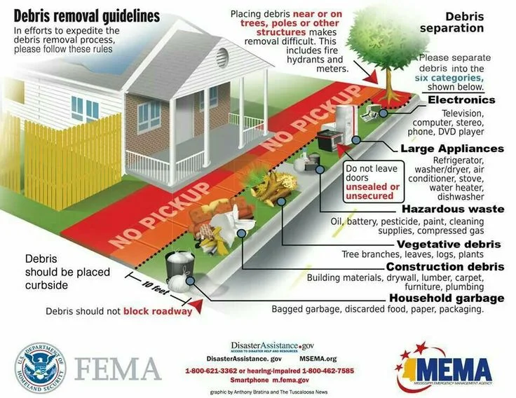
Are Disaster Infographics Still Cool? Useful?
/It seems like every week or month, I get "the latest" disaster infographic in my inbox. Inforgraphics have become popular in recent years to communicate complicated topics and data. There are infographics on social media, types of hazards, impact to businesses, emergency management careers, etc. I keep a Pinterest board for these types of graphics (see below).
Because I am largely a curator of this information, not a consumer, I am not clear how infographics have helped the industry. Are disaster infographics useful? How have they helped? Are they effective? Have you used any in your work? If so, how?
Check out of a few of the infographics below and let me know what you think.
Read More

